Upon request, you will receive a statistical analysis of the collective before-after results for all of your users to date. These objective, third-party-certified results can be utilized in your marketing and advertising campaigns and used to prove your work to the world. The results can also be useful to improve your product or service.
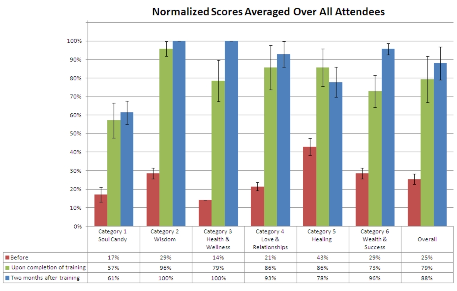
For the sample monthly statistical analysis shown below, we assume that the provider is Stellar Living, who offers a one-week training program that addresses the six facets of their teachings: Soul Candy, Wisdom, Health & Wellness, Love & Relationships, Healing and Wealth & Success. They expect their attendees to experience significant transformation in these areas immediately upon completion of the training and for up to two more months as the teachings sink in and the attendees start implementing what they learned into their daily routine. Stellar Living instructs their attendees to complete the online Quality-of-Life Quiz before the training, immediately following the training, and again two months after the training. The results of the assessment are summarized in the bar chart below, which shows the scores averaged over all attendees in each of the six assessment categories before the training (red bars), right after the training (green bars) and two months after the training (blue bars).
So What Does This Mean?
It Works! In this example, we see a large improvement in scores after the training program (green and blue bars) compared to the scores before the training (red bars). So this program works well; the attendees experienced transformation in all six areas.
Mastery Achieved. All of the attendees mastered the teachings in Category 2-Wisdom and Category 3-Health & Wellness (the blue bars are at 100%).
Fine Tuning. The "after" scores (green and blue bars) in Category 1, Soul Candy (Stellar Living's term for creative expression), are not as high as in the other categories. This tells Stellar Living that they need to improve their teachings in this area.
Error Bars. The black vertical lines centered in each bar above are called error bars. Error bars indicate the standard deviation—the variation in each attendees scores relative to the average score. Low standard deviation (short error bars) means that all attendees' scores were about the same, whereas high standard deviation (long error bars) means that attendees had a wide range of scores. For example, in Category 3 - Health & Wellness above, all attendees entered the training with about the same normalized score, 14% (red bar has short error bars). Right after the training, the attendees had a fairly broad range of scores as indicated by the tall error bars in the Category 3 green bar. Two months after training, however, everyone scored 100% in the Health & Wellness category, and the error bars are zero (no variation at all).
How Much Change Did Attendees Experience?
To answer this question, we calculate the before-after percentage change in each category for the two time frames of interest (right after the training and two months after the training) for each attendee, and then calculate the average before-after percentage change over all attendees for each category. The bar chart below represents the average difference in response scores after training compared to the responses given before training. The green bars are the before-after changes upon completion of the training, and the blue bars are the before-after changes two months after the training.
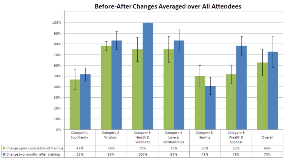
100% Improvement! A striking result we observe in this bar chart is the 100% change in Health & Wellness two months after the training. This means that all attendees selected "Extremely Inaccurate" for all positive health/wellness assessment statements before the training, and all attendees selected "Extremely Accurate" for these same statements two months after their training with Stellar Living. A potential marketing statement based on this result: "All of our training attendees experience a 100% transformation in their health and wellness."
Transformation Success. On average, attendees experienced a 75% improvement in the quality of their love and relationships (Category 4) immediately following the training (green bar), and after two months of integrating the training into their lives, their improvement increased to 83% (blue bar). Similarly, in Category 6, Wealth & Success, average improvement was 52% right after the training (green bar) and increased to 82% two months later (blue bar). Stellar Living can tout these results in their advertising and marketing campaigns.
Teachings Didn't Stick. Another interesting result observed in the charts above is that the improvement decreased in the Healing category after two months (the blue bar is lower than the green bar). This could mean that Stellar Living's Healing teachings didn't stick or that the attendees did not implement the healing strategies they were taught once they got home. In either case, this points to an area where Stellar Living can improve their training program.
Histograms
Another useful way to look at the data is with histograms, which provide more detailed information. In the above bar chart we see that the overall average change for all attendees two months after training is 73% (rightmost blue bar). So we can say that on average, Stellar Living's training attendees improved their Quality of Life by 73%. We would also like to know the distribution of attendees' scores rather than just the average score, since some people did better than 73% and others worse. The histogram below shows this distribution.
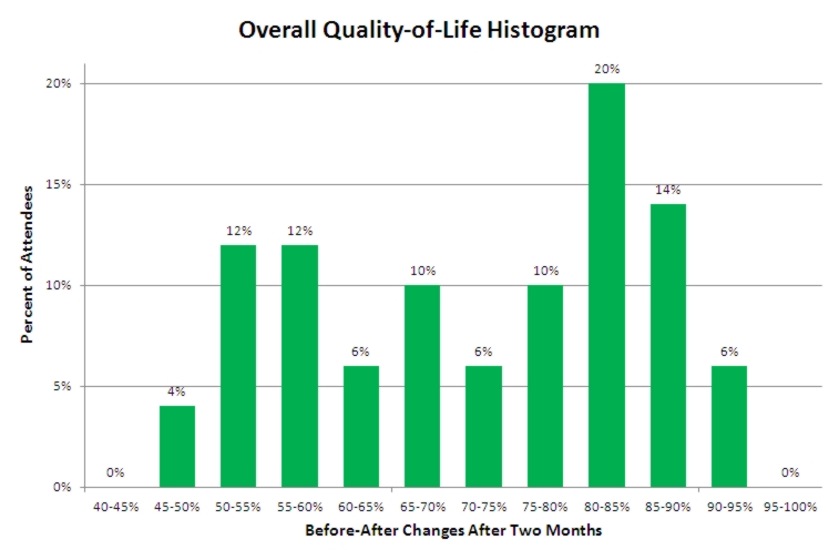
Percentage of People Transformed. From this graph we see that 20% of the attendees experienced an 80 to 85% improvement in the overall quality of their life (third green bar from the right). We could also say that 40% (20%+14%+6%, three rightmost green bars) of the attendees experienced 80% or better improvement in their overall quality of life. Alternatively, we could say that 96% of all attendees (sum of all except the leftmost bar) experienced an improvement in their quality of life of 50% or better. Potential marketing statement: "96% of our training attendees improved their quality of life by 50% or more."
Customized Statistical Analysis
These are just a few of the many available data analysis approaches. We work with you to determine which analysis methods and tools best exemplify your assessment results. You will decide how to use the statistical results to promote the effectiveness and increase the profitability of your product or service.
You can choose to have only one or up to six categories—whatever meets your needs. We show six categories in this example to illustrate the full capabilities of the Stellar Research online personal progress tracking system.
|